I currently work as a designer at a dental marketing company, where I design and build accessible, high-quality websites for dental practices. My work focuses on creating clear, usable experiences within a custom CMS, translating client requirements into scalable, maintainable solutions. I work extensively with HTML, CSS, and JavaScript, and have developed a strong understanding of the platform’s constraints and patterns to deliver reliable, well-structured sites.
In addition to technical expertise, I actively collaborate with clients, dental practices, and dental service organizations. This collaboration helps surface user needs, industry constraints, and client goals, informing design decisions that align with both business objectives and end-user expectations.
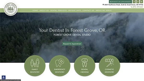
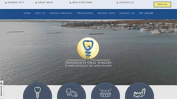
I not only build websites from end-to-end, but I have completed many website redesigns. The following is a case study for Progressive Oral Surgery.
Redesigns
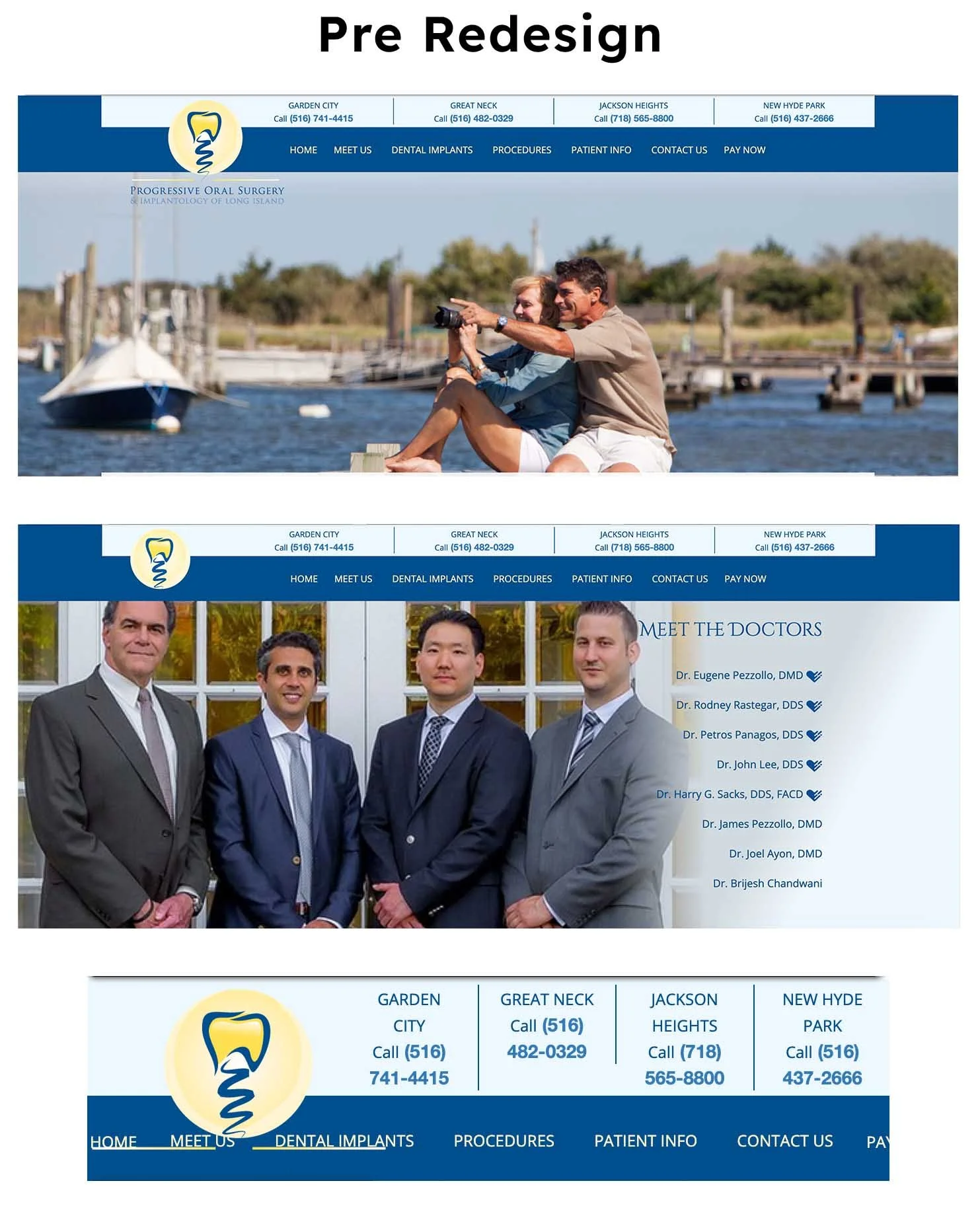
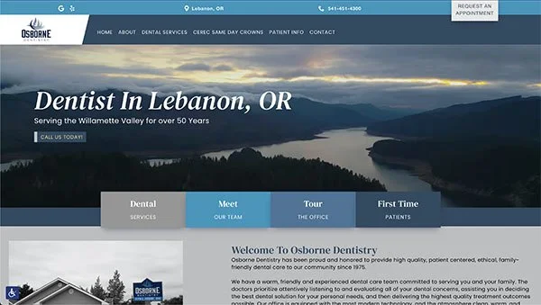
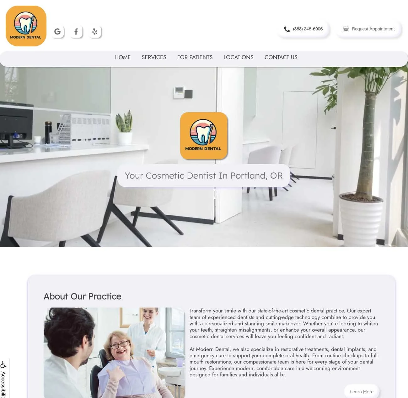
Progressive Oral Surgery is a large multi-doctor, multi-location practice on Long Island. The previous site felt visually crowded and made it harder to quickly identify the brand, navigate on mobile, and find key information like doctors and locations.
For the redesign, I made the brand more visible by making the logo more prominent in the hero and centering it over an animated shoreline video banner that accurately reflects the local scenery. I also updated the typography to a cleaner, more readable font set to improve scanability and reduce visual noise across the site.
A major UX challenge was making the doctor team easier to understand at a glance. On the previous homepage, it was not always clear which doctor was who. I reorganized the layout to give each doctor their own headshot and a direct link so users can quickly identify and learn more about the specific providers. I felt that it highlighted the team in a way that was easier to browse and did not feel clustered or overwhelming.
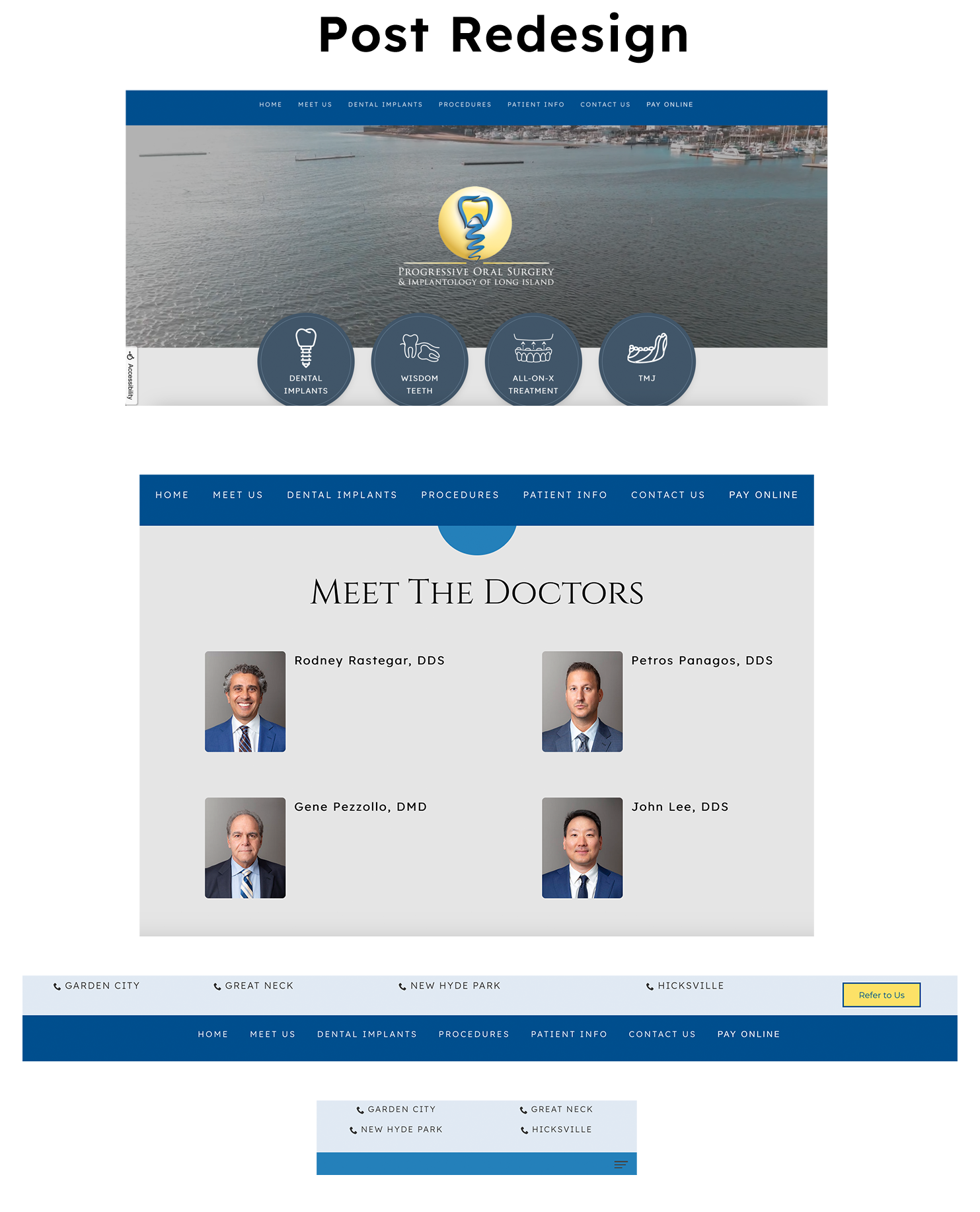
To support multi-location needs, I rebuilt the navigation to be clearer and more usable on both desktop and mobile, and strengthened the footer layout so office locations and contact details are easier to find. The final site is more spacious, modern, and easier to use, all while showcasing the practice at a higher level of polish.
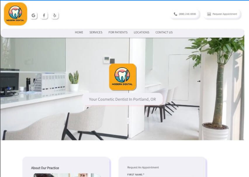
Original Dental Design Templates
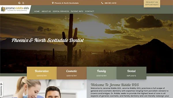
My company offers several templated options for dental practices to support fast builds, content-heavy sites for SEO, but more importantly ongoing reuse. I created this design as an exploration of a more modern system that can exist within an industry that leans towards more traditional tastes, while still prioritizing clarity, accessibility, and ease of maintenance.
I desired to build something original that felt calm, minimal, and approachable. Drawing loosely from neumorphic principles, I used soft elevation, rounded forms, and restrained depth to create a sense of tactility and hierarchy, while keeping the interface friendly and easy to scan for dental audiences.
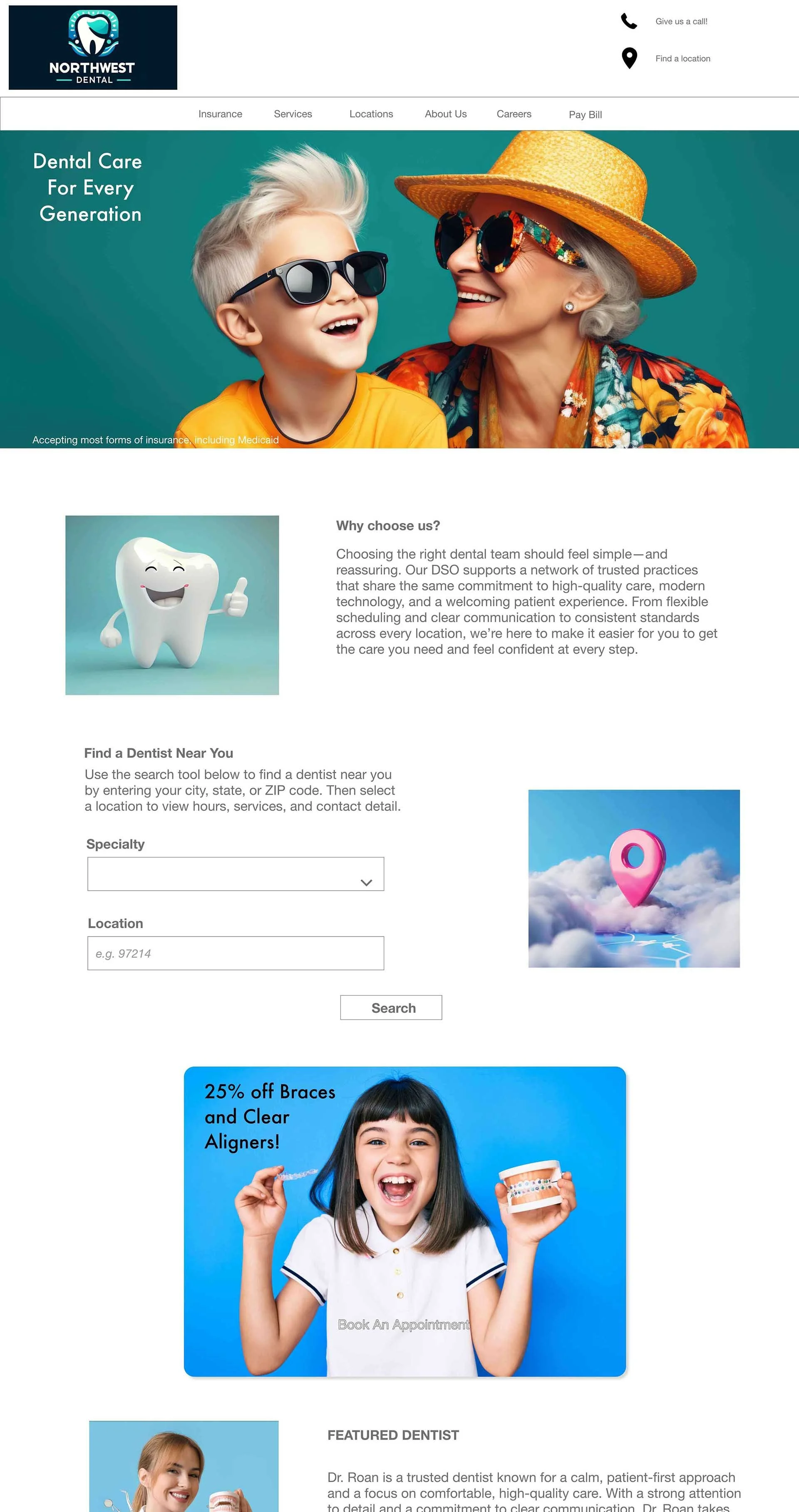
Moody Modern Design Template
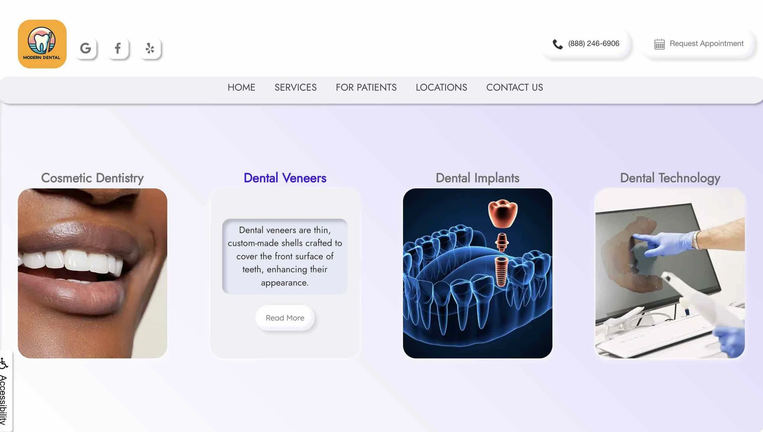
The core of the design is rooted in structure and flexibility. As opposed to designing a one-off landing page, I built the template from scratch as a reusable system, starting with a basic mockup and refining it through real-world use. I created modular layout patterns and reusable CSS classes to support quick customization, allowing content, spacing, and visual emphasis to adapt without requiring big structural changes.
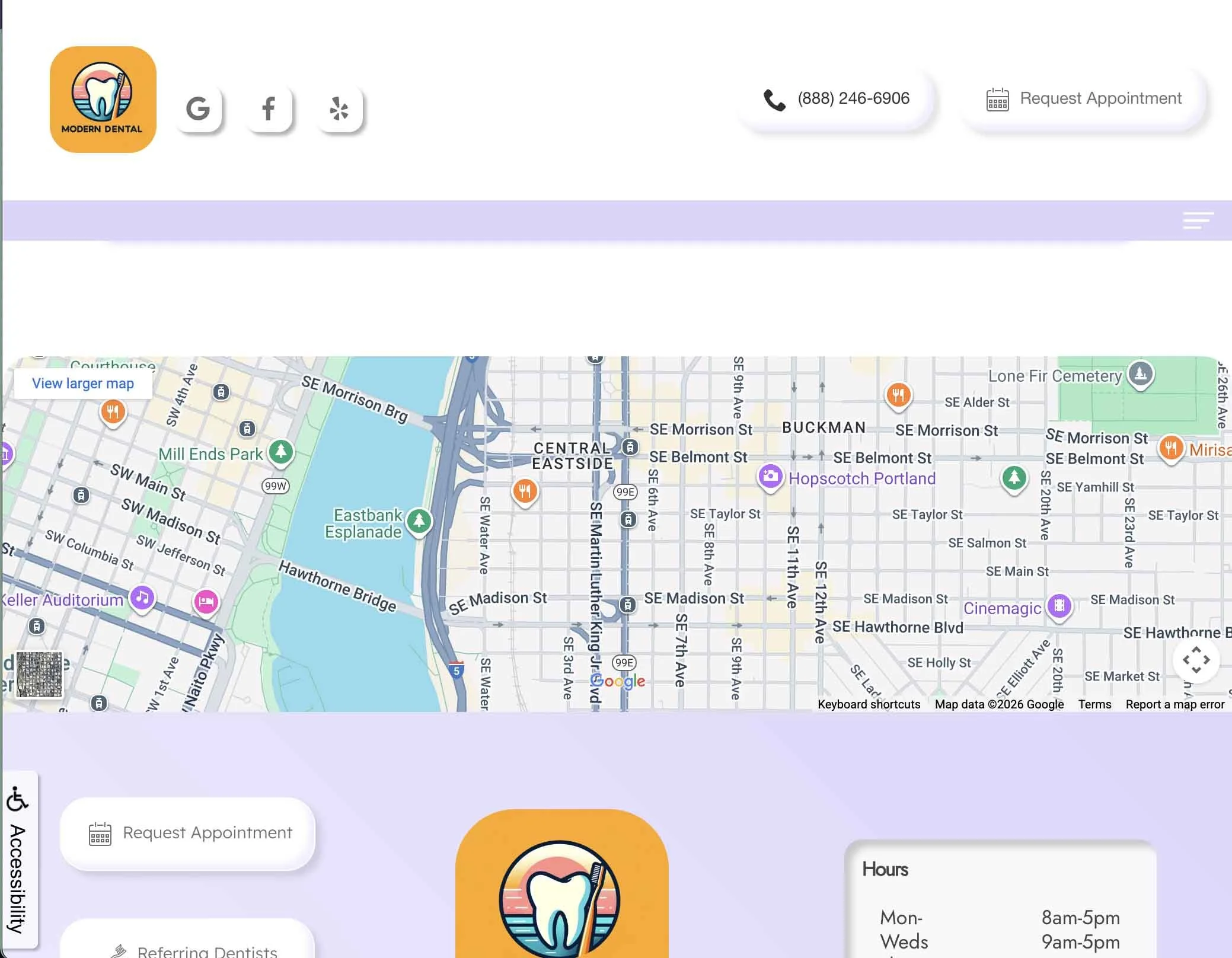
Over time I revisited and refined the Moody Modern Template to improve content flow and reduce visual noise. These updates include strengthening location content through an embedded Google Map. This not only supports usability, but SEO. I added the option for dental associations and affiliations to signal institutional credibility. Furthermore I refined the section separation such as the Services layout to better support dense informational content.
The template was built and implemented within my company’s custom CMS using HTML and CSS, and Bootstrap. The final result is a polished, flexible template that balances modern design sensibilities with real-world constraints, supporting clarity, usability, and long-term reuse.
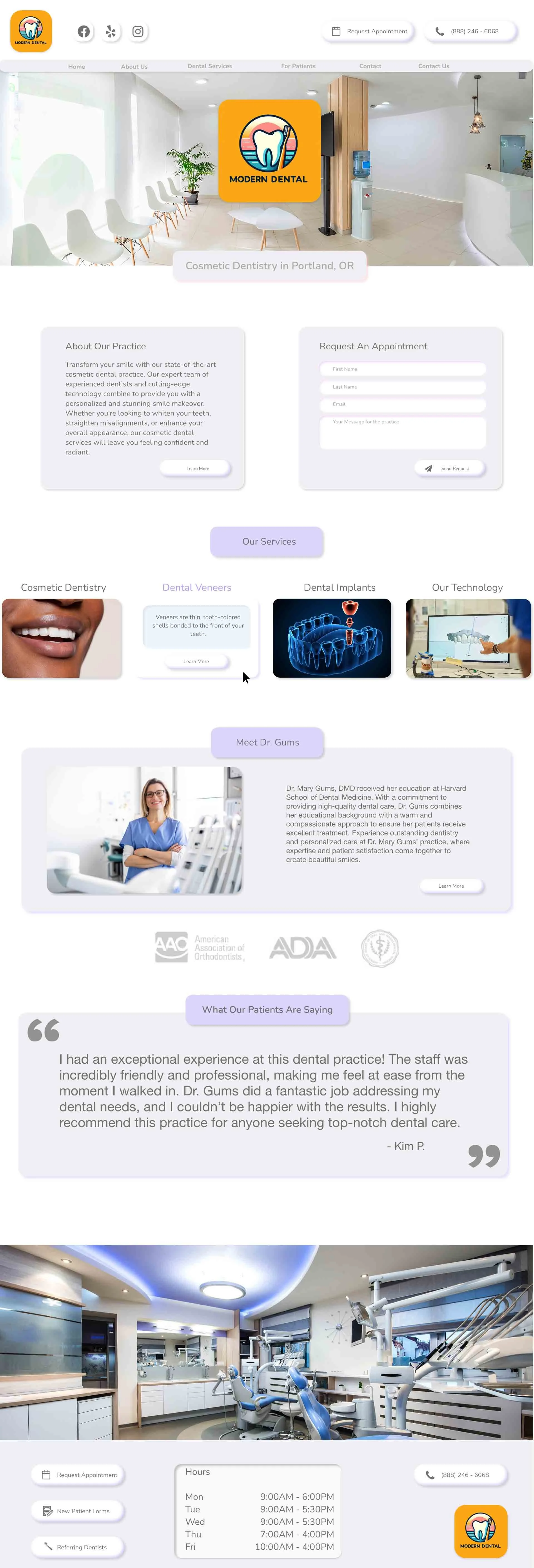
Original design mockup created with Adobe XD
Overview Video
I designed a website template specifically for Dental Service Organizations (DSOs), which are companies that provide business support services to dental practices. DSOs handle administrative functions like marketing, staffing, and IT management, allowing dentists to focus on patient care. The template I created was built with SEO optimization as a core focus, ensuring that it can easily handle large volumes of keyword-rich content without compromising site speed or user experience. This is crucial for DSOs looking to boost their online presence and attract new clients. The design was crafted with scalability in mind, supporting multiple locations across regions or states while maintaining a cohesive brand identity. The color scheme draws from corporate hues like dark green and blue to reflect professionalism and trust, while subtle design elements, such as playful icons or dynamic call-to-action buttons, introduce a sense of approachability and modernity, striking a balance between corporate sophistication and a friendly, patient-focused vibe. This template ensures that each location can have its own page with localized content, yet all sites feel unified under a single, well-designed brand umbrella.
DSO Design Mockup
After several years teaching computer science, art, and college-level web design, I transitioned into independent design projects for small businesses, creative professionals, and service-based organizations. This work emphasized clarity, accessibility, and thoughtful interaction design, while building practical experience delivering real-world digital projects end to end. While my career focus continues to evolve, these projects reflect hands-on experience translating complex or ambiguous needs into clear, usable interfaces under real constraints.
UX and visual design, mobile-first layout and responsive behavior, front-end customization, content structure and copy guidance, client collaboration and iteration
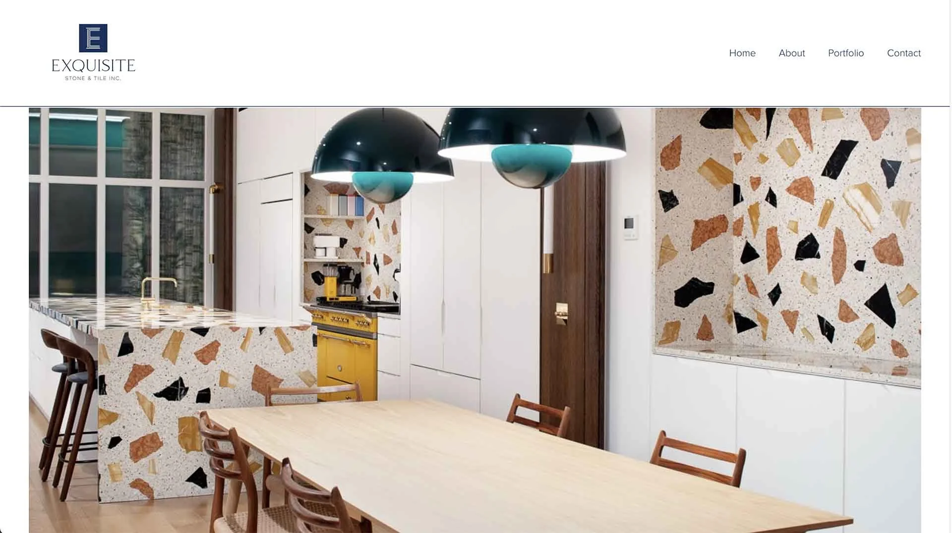
Exquisite Stone and Tile
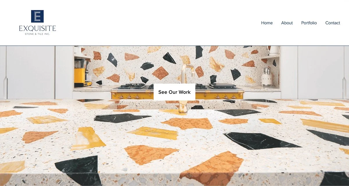
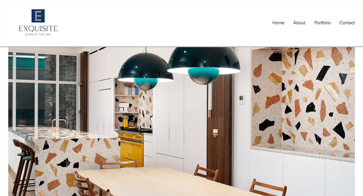
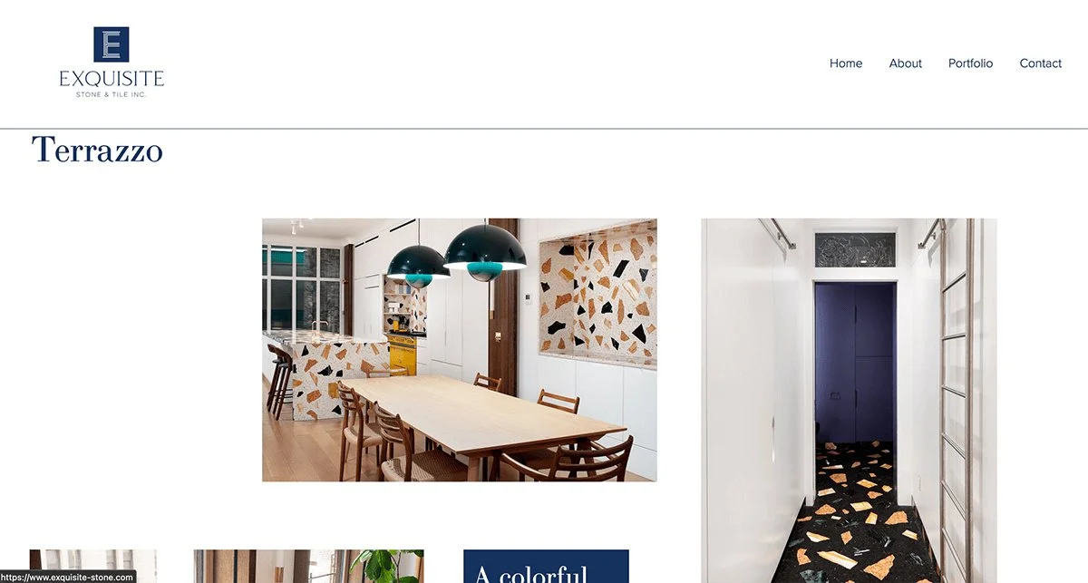
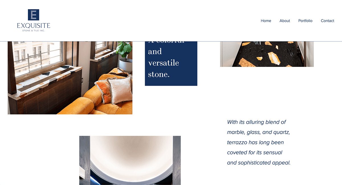
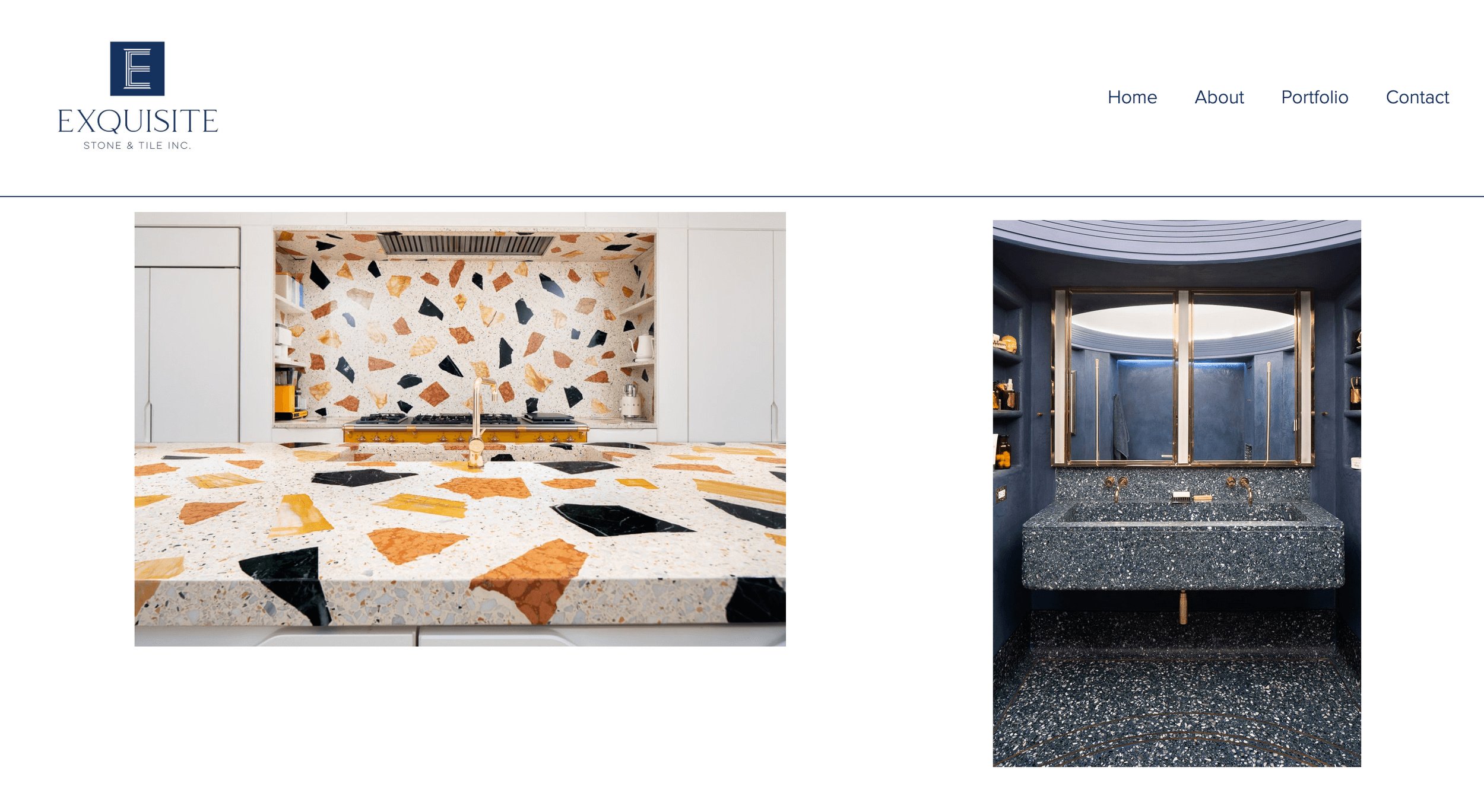
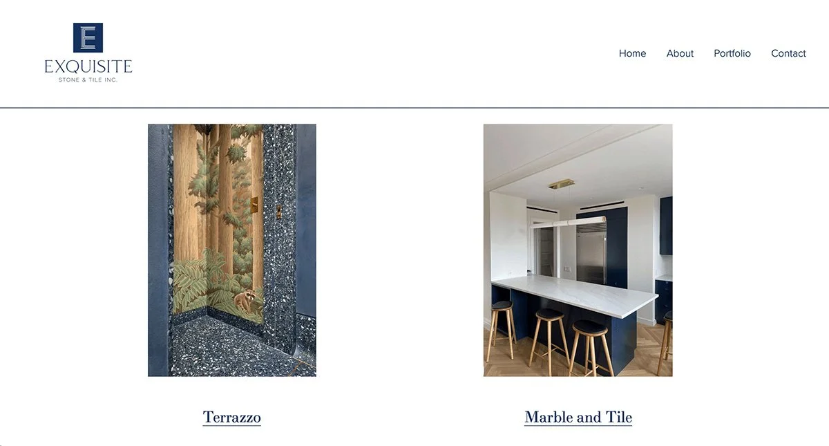
Client is a high-end stone work and tile business who serves architects and homeowners in the New York City area. Their online presence was minimal and lacked a showcase of the variety and quality of materials that they specialize in. This made it difficult for potential clients to quickly assess fit or visual style.
Problem
I designed a clean, mobile-responsive site focused on clarity, ease of navigation and most importantly material discovery. In order to align on layout, hierarchy, and visual tone I crafted some early mockups before development began.
We chose Squarespace to intentionally balance custom design needs with long-term maintainability, allowing the client to make their own minimal updates. I utilized custom HTML, CSS, and Javascript via code injection to extend the design features beyond the default platform limitations. This included subtle homepage animations which I implemented with jQuery to add polish, without distracting from the content. In addition to interface design, I collaborated with the client on content strategy, helping them shape copy for key sections to better communicate the services they offer, their expertise, and value to first-time visitors.
Approach
The final product successfully highlighted the Exquisite Stone and Tile’s craftsmanship and materials while being easy to navigate and access across different devices. The client reported a high level of satisfaction with both the design process and the finished product, and noted their appreciation for the added support around content and problem-solving.
Results
““It was a pleasure to work with Rich on building a website for my company. He is talented, resourceful, super personable and easy to work with. He is very good at creative problem solving and he listened closely to what I wanted and executed it just how I imagined it. He also went above and beyond by providing me with copy ideas for my website. I am very happy with the finished product!””
Exquisite Stone Founder
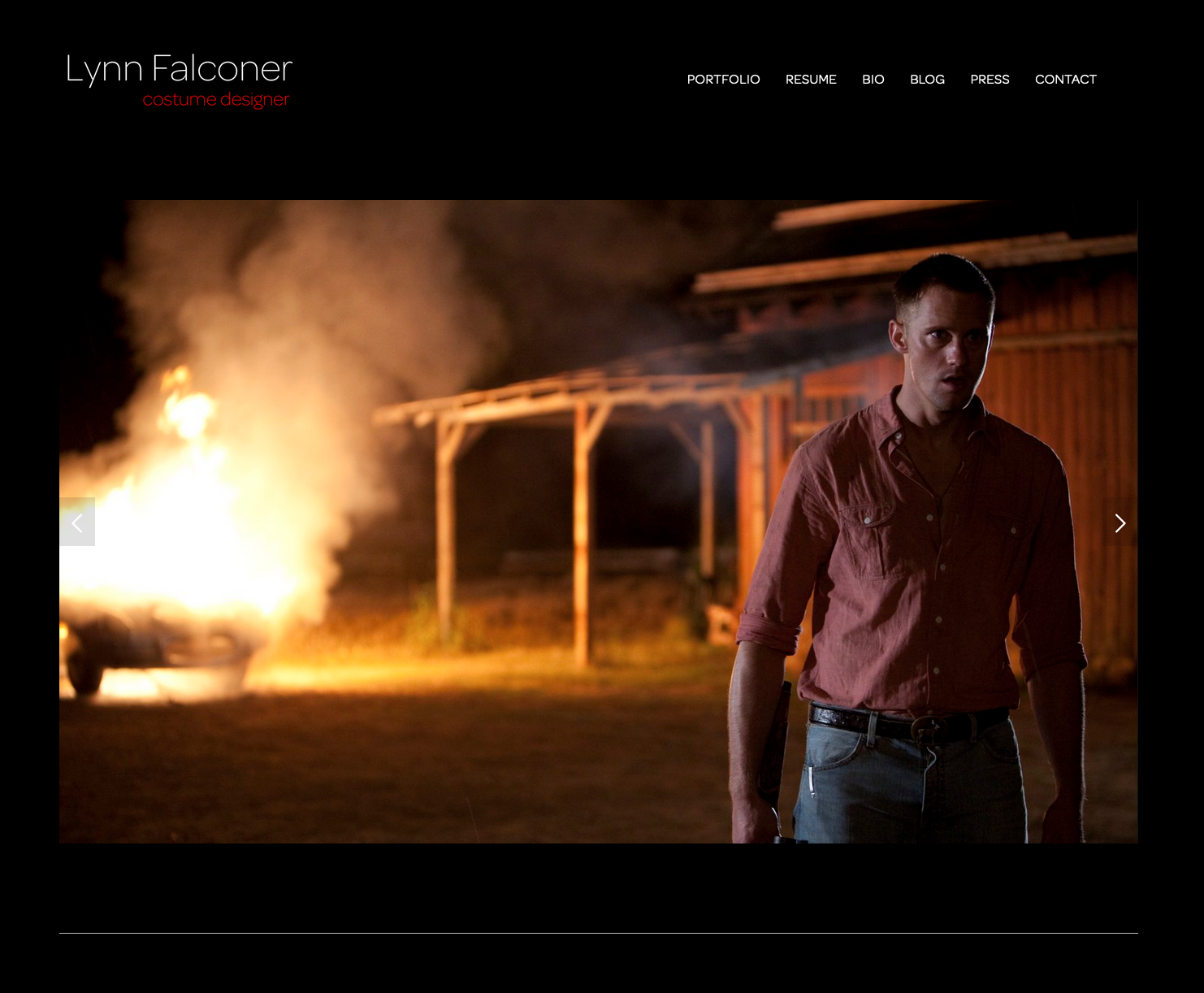
Lynn Falconer: Costume Designer
UX and visual redesign, information architecture and portfolio navigation, mobile-responsive layout, visual storytelling and theme selection, custom media creation, iteration, and client collaboration.
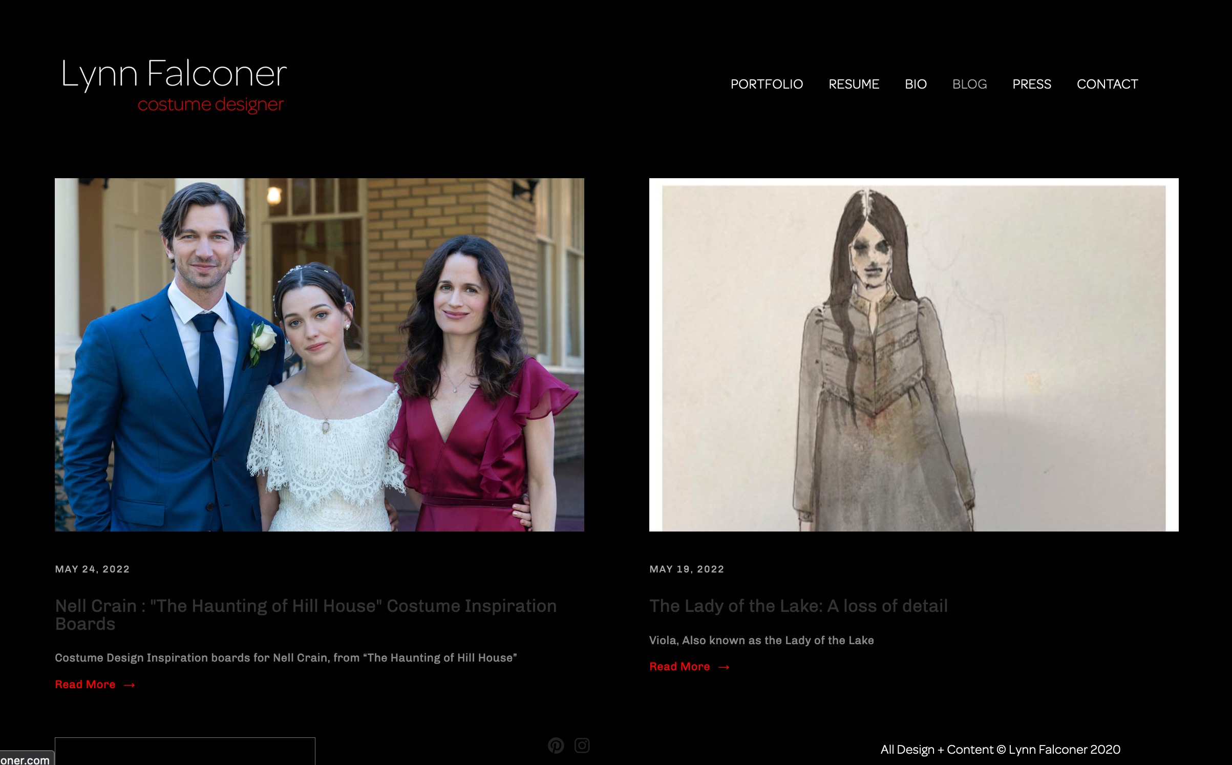
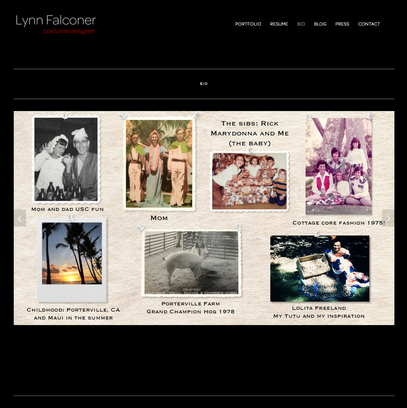
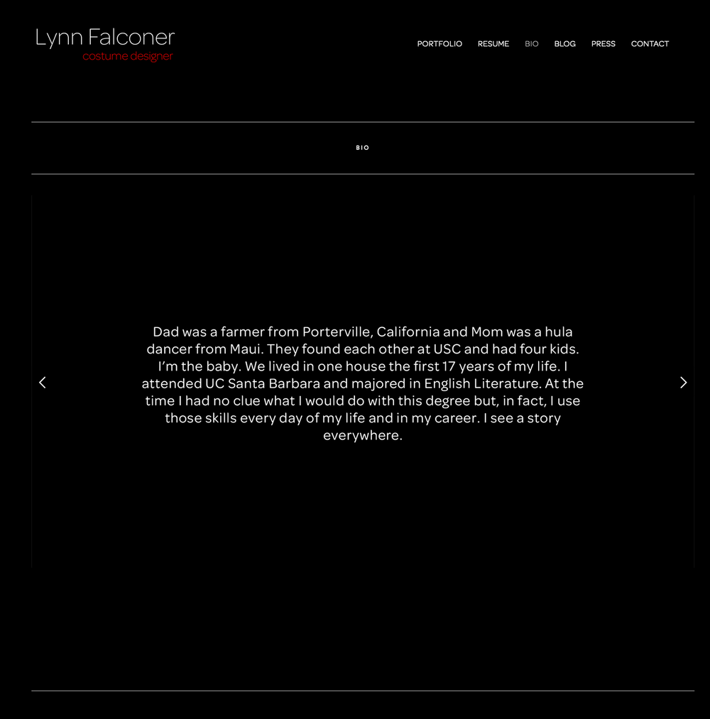
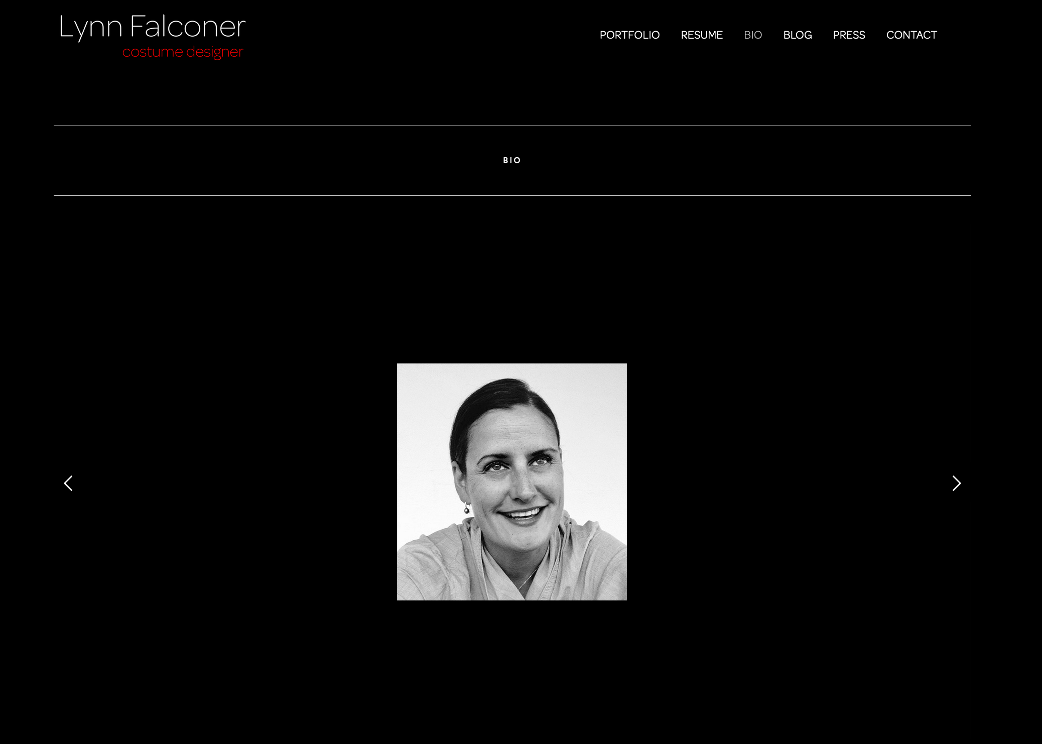
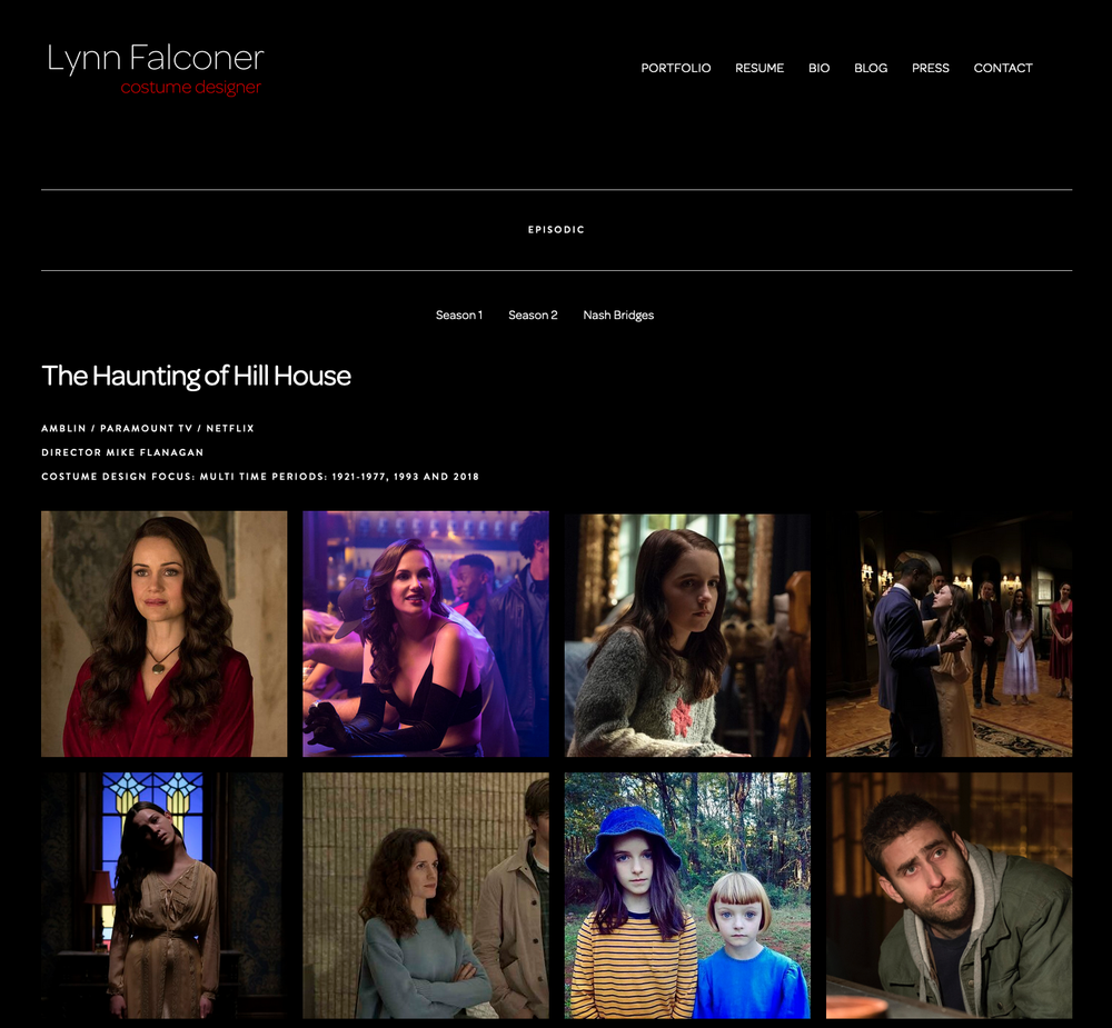
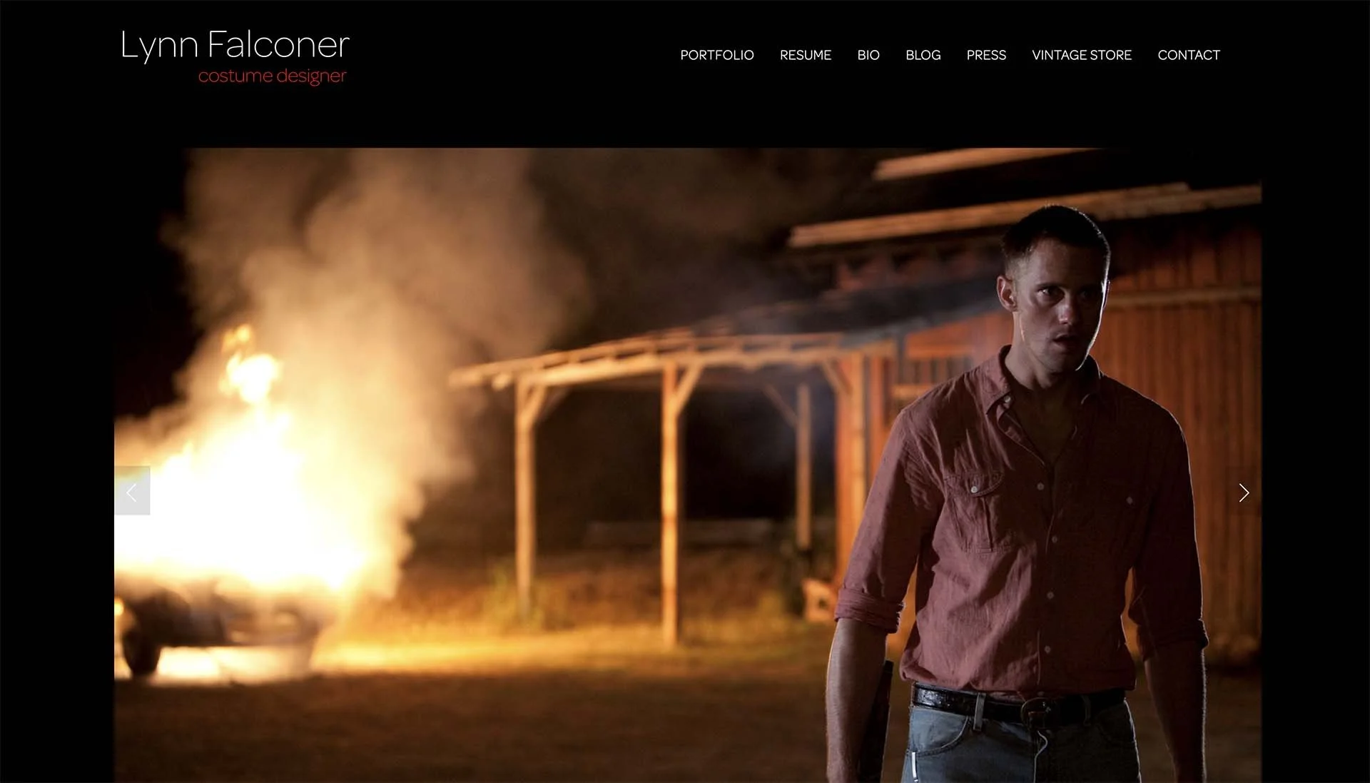
Lynn Falconer is an LA based costume designer with credits across film and Netflix productions. She felt that her previous website didn’t adequately showcase the breadth and visual impact of her work. Moreover the overall presentation felt misaligned with the professional, cinematic nature of her portfolio. She expressed a needed improvement in content structure, including a clearer portfolio navigation, a biography section, as well as a blog. This was to better support potential industry visitors to the site like directors, producers, and collaborators.
Problem
I redesigned the site with a focus on content hierarchy, visual emphasis, and ease of exploration. Restructuring the navigation was implemented to help visitors quickly scan and dive into feature projects, while new sections were introduced to support storytelling around Lynn’s career and process.
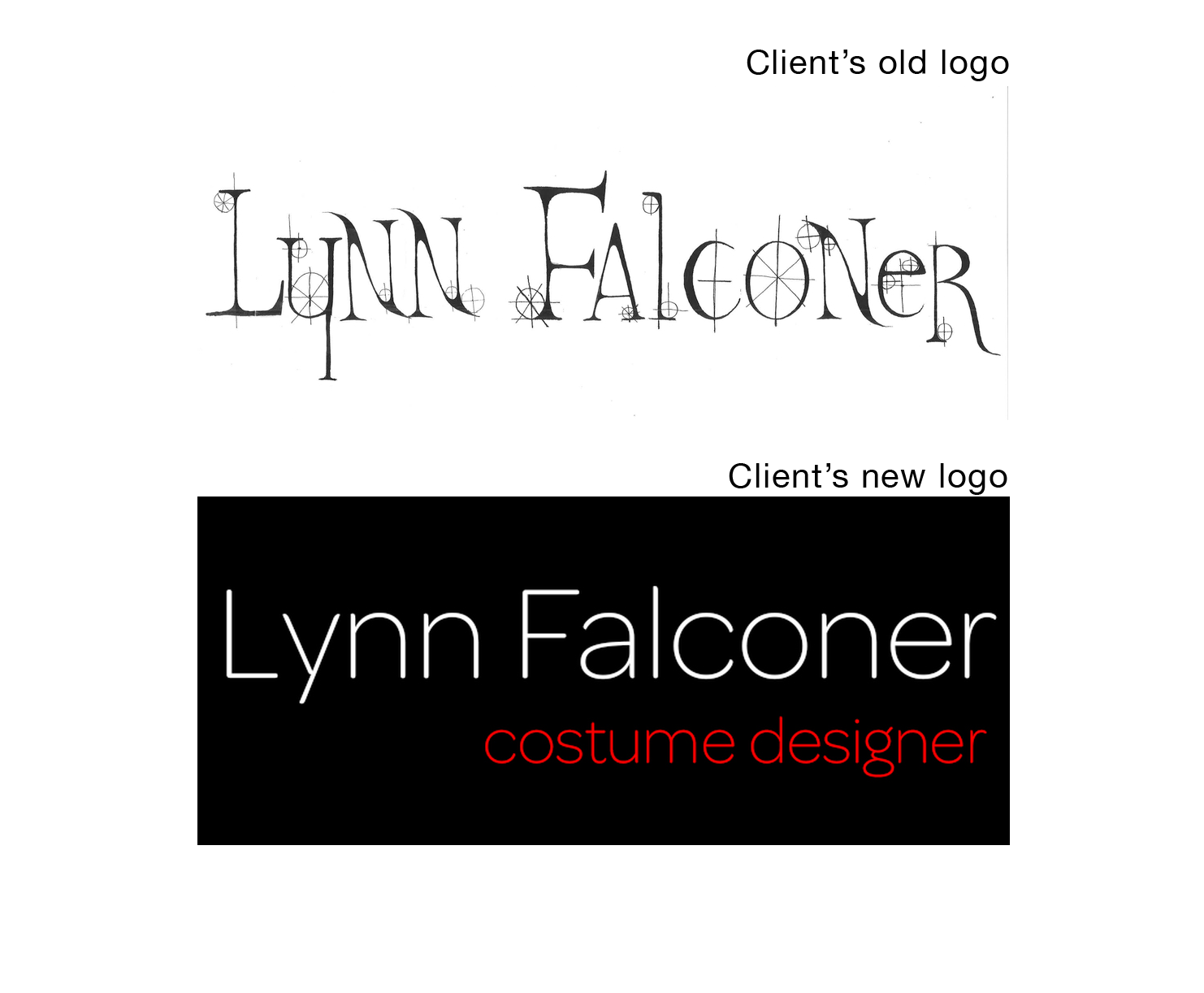
A big change from the previous site was selecting a dark visual theme. This was chosen to highlight the photography, texture, and detail of her work without overwhelming the content. Mobile responsiveness was prioritized to ensure the portfolio remained compelling across devices. Design mockups were shared and refined through a second round of iteration. For the bio section, I created a custom collage-style slideshow using Adobe Photoshop to visually contextualize her experience and body of work.
Approach
The new site presents Lynn’s work in a more confident, professional and visually cohesive way. We moved away from the original kitschy aesthetic toward a bolder, cleaner visual system that better aligns with film and television industry standards. I made the key imagery larger, letting it speak for itself, by showcasing recognizable actors, productions and settings while improving navigation to make the portfolio easier and more pleasant to explore. The client expressed strong satisfaction with both the process and the final result, particularly valuing clear communication, thoughtful and intentional design decisions, and transparency around technical constraints.
Results
UX and visual design across therapy practices, information architecture and content hierarchy, accessibility and cognition-aware design decisions, visual system refinement (color, typography, layout), collaboration with UX and content partners, iterative refinement based on client feedback
“Rich has a very developed sense of design, I love his eye. He was reasonable in his rate and his work ethic was awesome. I lagged a bit on providing some materials because of my work schedule but he was very laid back about that which I appreciate. He delivered exactly what I wanted and was honest about what could and couldn’t be done. He did a great job and I will come back to hire him for sure!”
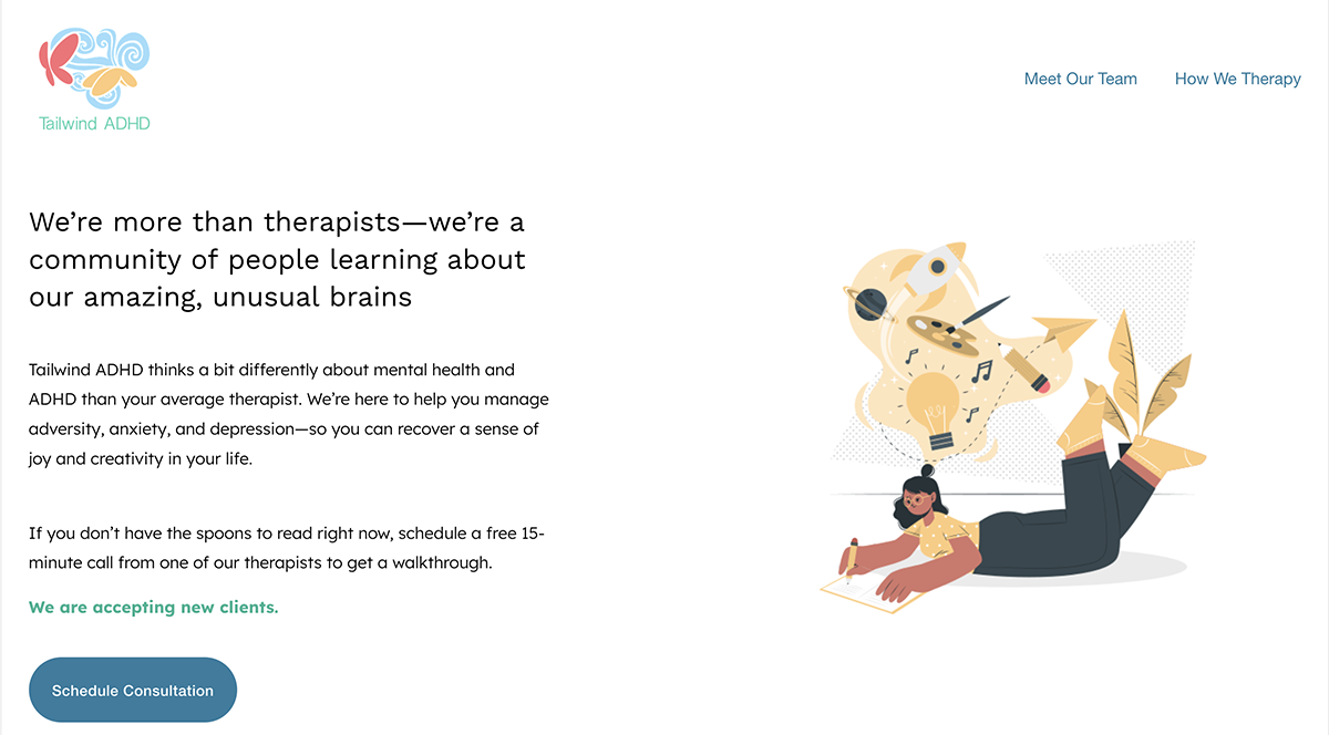
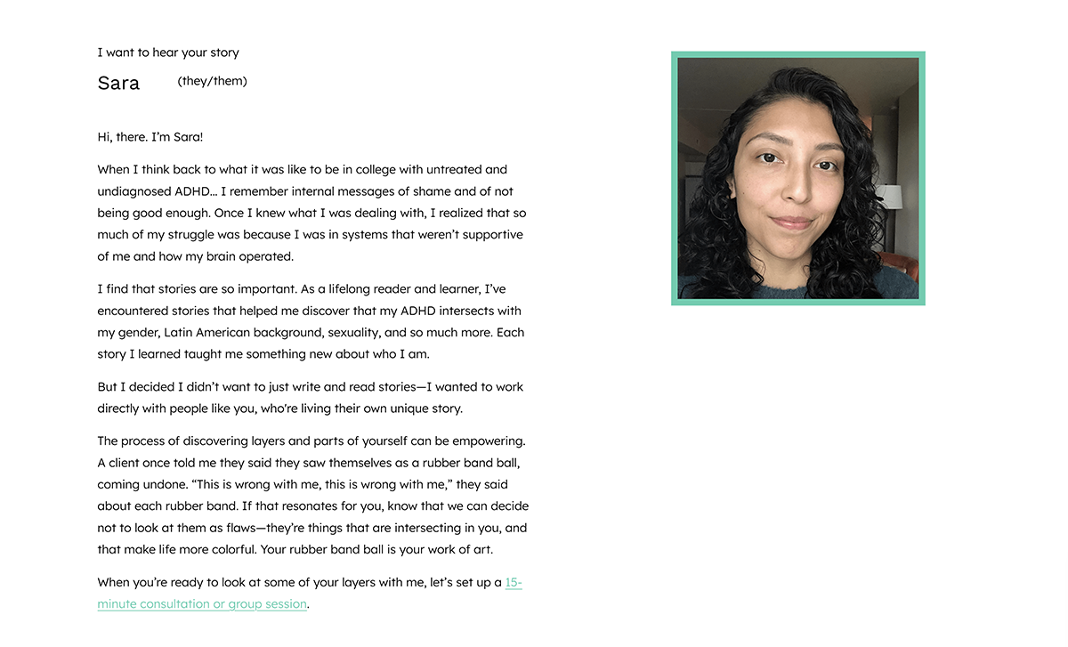
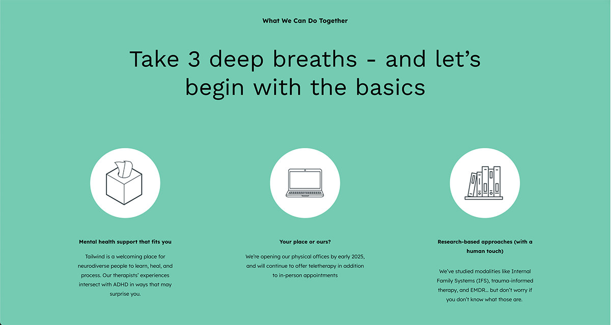
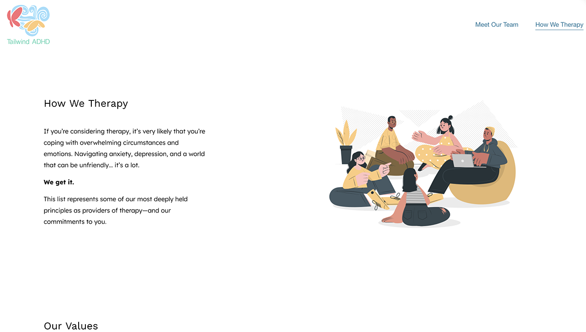
Mental Health Practices
I worked with multiple therapy practices to design websites that support trust, clarity, and accessibility–particularly clients navigating neurodivergence, recovery, or emotional stress. The focus across each of these projects has been on creating calm, navigable digital experiences that communicate professionalism without adding cognitive load or emotional burden.
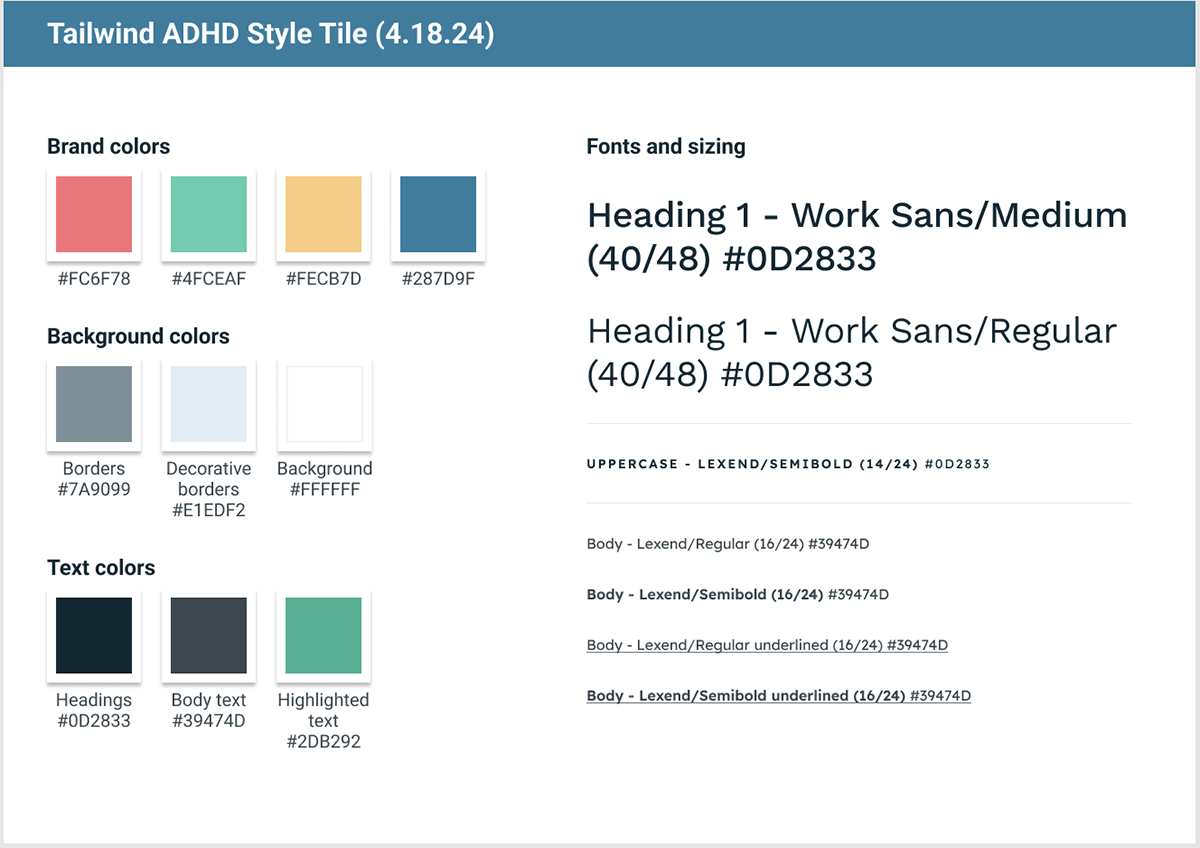
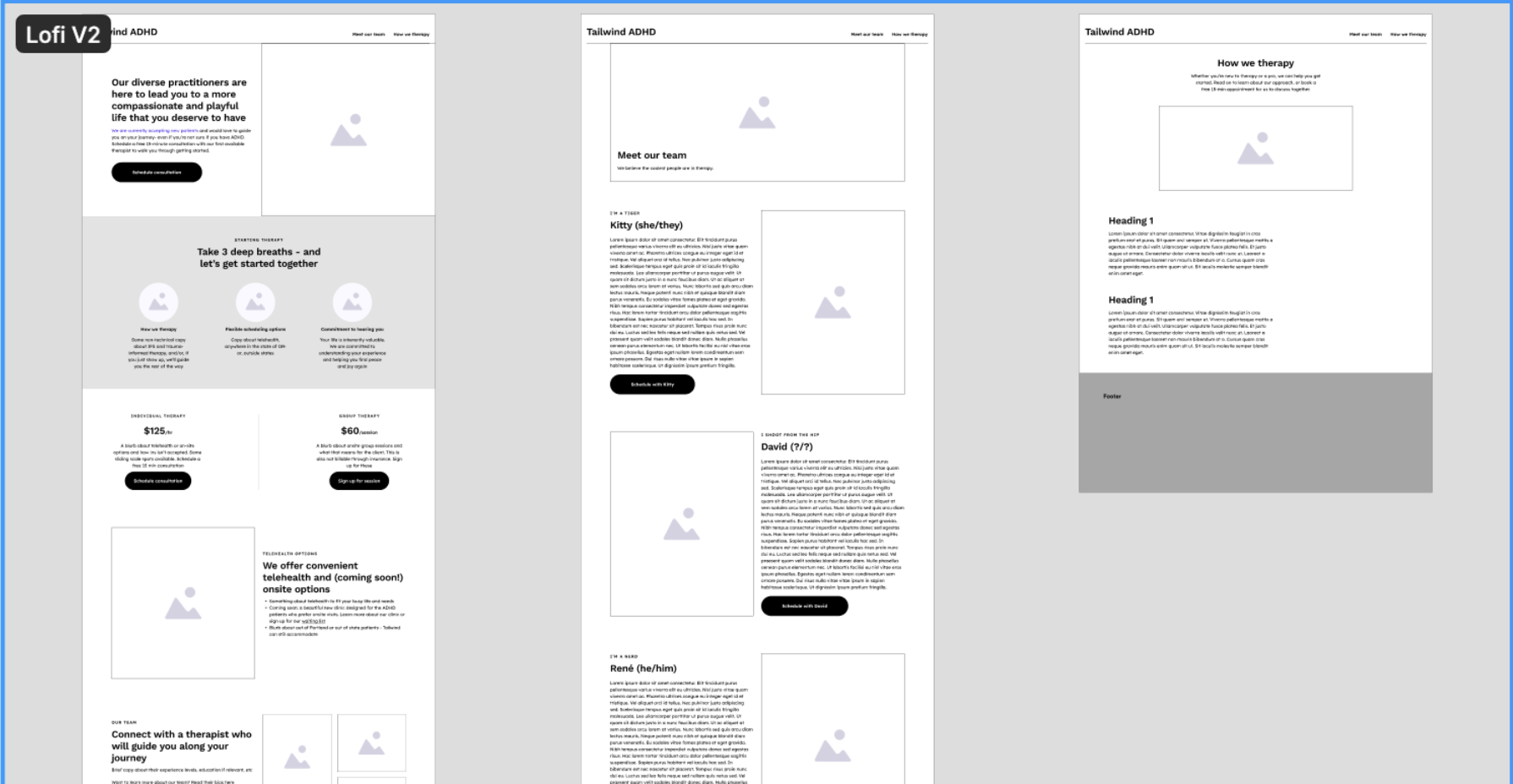
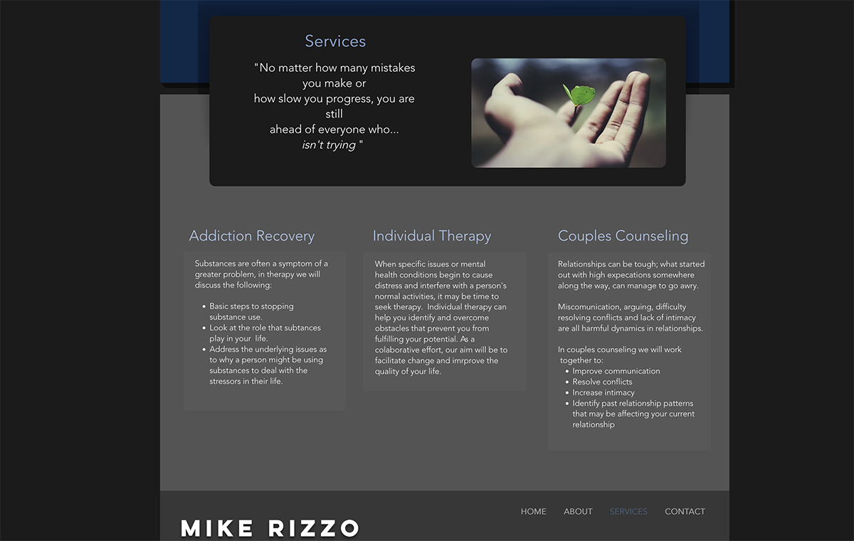
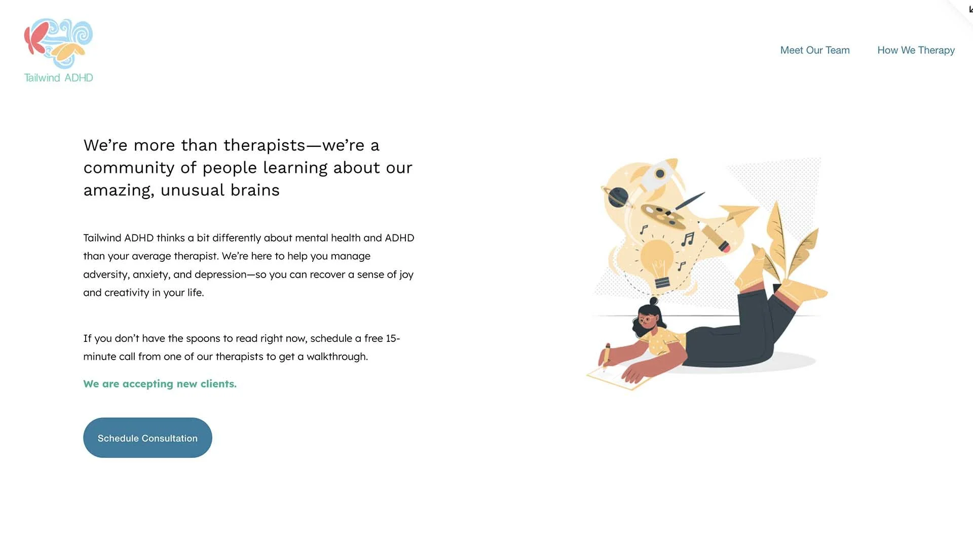
For one practice specializing in ADHD treatment, I collaborated with a UX designer and a content developer. We created a visually engaging yet low-friction experience. Simplified layouts, clear typography, and a calm color palette were utilized to reduce cognitive load. The content was structured to be concise, supportive, and easily scannable, which reflected the needs of those actively seeking care.
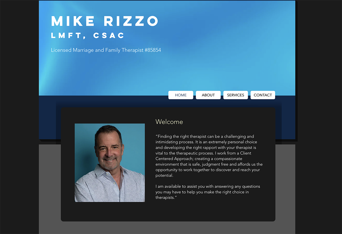
In a separate engagement with an LA based therapist specializing in substance abuse recovery, I refreshed an existing website to improve visual cohesion and clarity. The layout was refined to create a stronger visual hierarchy and consistency. I also update the visual system to have deeper blues and grays with warm accents to convey stability and trust. Selected imagery and quotes were incorporated to support reassurance, but not lead to distraction.
UX and visual design across therapy practices, information architecture and content hierarchy, accessibility and cognition-aware design decisions, visual system refinement (color, typography, layout), collaboration with UX and content partners, iterative refinement based on client feedback
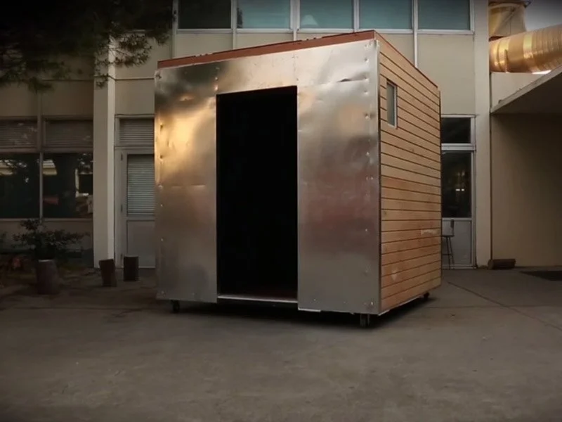
The Live Cube was an interactive tiny house experience that explored a near-future dystopia driven by climate change and resource scarcity. This project, developed as my graduate thesis, delved into the challenges of survival in an increasingly unstable world.
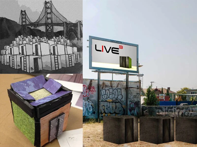
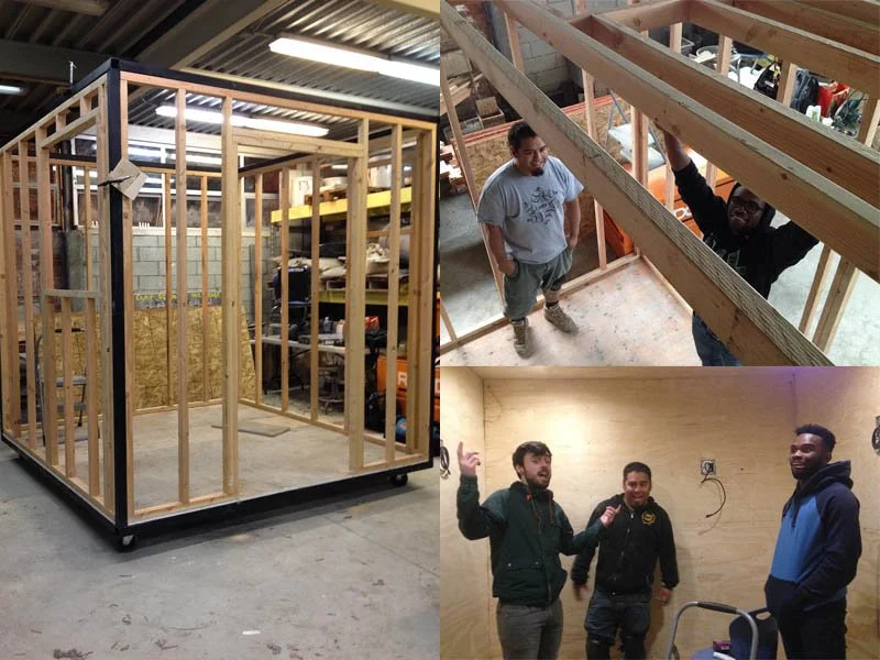
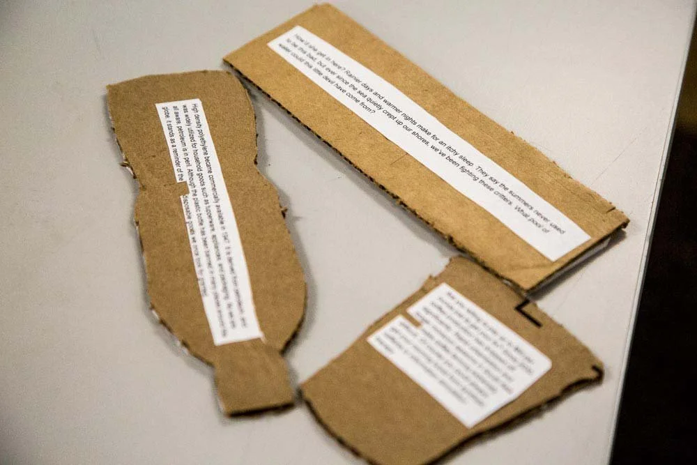
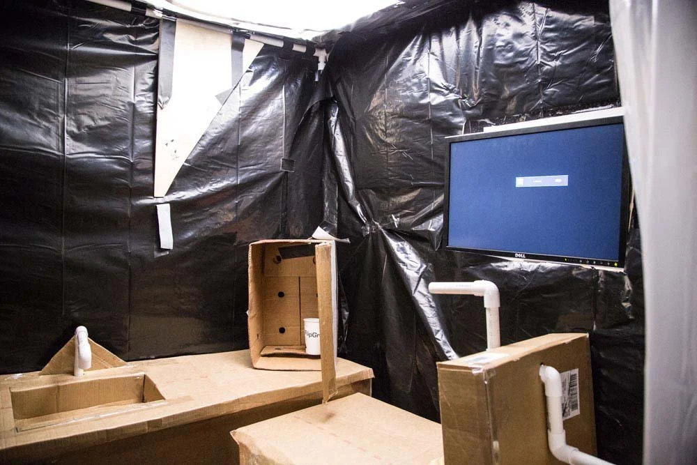
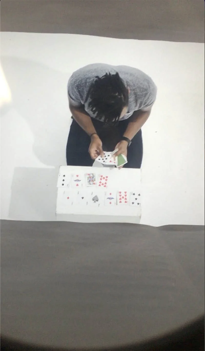
Before we even began constructing the Live Cube itself, we conducted iterative low-fidelity prototyping to test spatial concepts, interaction, and narrative clarity. Early prototypes were constructed using cardboard, paper, plastic sheets, and PVC piping to simulate the enclosure, scale, and flow through the space. This allowed us to capture potential participant engagement, identify which objects and moments resonated the most, as well as identify any points of confusion or overload. These user-testing sessions were filmed, documented, and the insights directly informed subsequent design decisions like spatial layout, which objects to include, interaction timing and narrative flow.
We collaboratively designed and built the full Live Cube structure and its interactive components, constructing the physical environment from the ground up. The installation integrated digital and physical systems through laser cutting, 3D printing, and microcontroller-based interaction. We designed and implemented on-screen interaction sequences, sourced and integrated audio, and programmed system behaviors using Java alongside Raspberry Pi and Arduino hardware to control environmental responses and guide the flow of the experience.
Live Cube was exhibited at Maker Faire, where it received multiple awards that year, recognizing both its technical execution and experiential design. The project ultimately functioned as a study in user-centered systems and narrative design under extreme constraints, thus demonstrating how research, prototyping, and technology can be integrated to create meaning, immersion, and engagement within a physical experience.
Live Cube was an interactive installation developed as my graduate thesis, exploring a near-future shaped by climate change, resource scarcity, and constrained living. The project examined how people perceive, navigate, and emotionally respond to bounded environments. It simultaneously explored how narrative, space, and interaction design can shape those responses.
The work began with extensive brainstorming and concept development. As a team we explored speculative scenarios, themes, and user journeys through sketches, concept images and sculptures that helped externalize our ideas early on. I was particularly engaged in shaping the story and narrative arc by developing the world-building, pacing, and narrative beats that would inform how participants encountered and interpreted the space.
Links and Resources
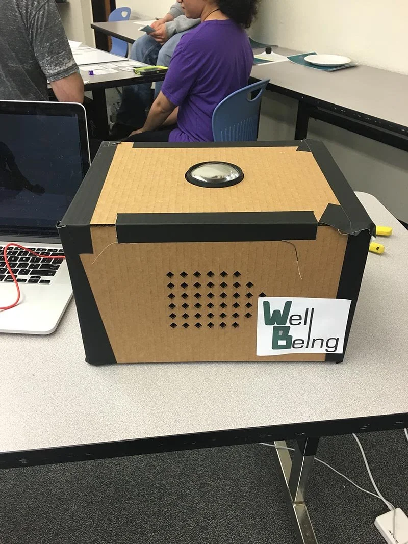
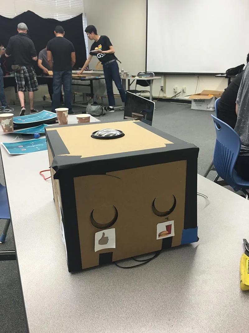
This project, was inspired by Tamagotchi, the hit virtual pet from the late 1990s. It employs a physical box with a screen displaying a virtual character. Users are invited to interact with the character through a a series of buttons on the side of the box. The buttons serve as input for a web application, featuring actions like "encourage" or "feed" to influence the character’s emotional state. The emotional state is displayed in real-time through short video clips. These 40-50 video clips, which we filmed and directed, depict a range of emotions and reactions based on user input and the character's overall well-being. Technologies used include the Youtube Player API, Ruby on Rails, Javascript, and AJAX for video playback and interaction.
Having visited three national parks, I sought to create an engaging content repository for my photos and videos. I built and deployed a full-stack application utilizing a non-relational database and asynchronous JavaScript frameworks including Node, Express, MongoDB, Mongoose. This application allowed users to geographically view media from each park and even add their own trails.
A blind contour drawing application. Blind contour drawing is an exercise where the artist draws the subject without looking at the paper (in this case the HTML canvas). I wanted to make something fun and interactive. Users were also able to see other artists' renditions of a particular subject. Utilized Ruby on Rails, Postgresql, jQuery, Javascript, Bootstrap, Pure CSS, and Amazon Web Services.
What do the images we consume say about ourselves? What preconceived notions might we have about a place? I worked collaboratively in Ruby on Rails to build a photo voting application. Photos were randomly served to users using the Flickr API, but the location of a photo is kept anonymous. Users would vote “hot” or “not” on a photo and the stats would be collected on the location.
Tasked to collaboratively build a travel and couchsurfing website. In a small group planned, built, and deployed a full stack Ruby on Rails application using Github, pair-programming, and agile workflow.